In Power BI, when we have a bar chart displaying quite a long period of time like the chart below, it might be quite hard for users to read which bar is the start date of a month. Therefore, we can consider highlight the bar of the first date of each month with a different color to make the chart clearer and easier to read. This article is explaining how we can achieve that.

Normally we have a date dimension table that contains all the date we need for the data visualization. So the easiest way to achieve that is creating a measure to match the date to the start date of each month. In that case, it is pretty simple. You only need to create one measure to define the color for different bars and then use conditional formatting to connect the color to your measure. Here is an example of the formula of the measure:
1 | |
The following graph is the result of this fomula.
However, from the above graph, we can see that there is no start day for June. It is because the first day of June is Saturday, and we only have data for business days. Therefore, we need to think about how to find out the first business day of each month in order to display the chart in a clearer form.
The solution I came out with is to add a column to our date dimension table first, which defines the first business day of the corresponding month for each date.
1 | |
After we apply the above dax formula, we will have the new colomn adding to our table. Next, we can create a measure to assign different colors to the bars.
1 | |
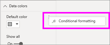
After we create the measure, we can go to the format pane and select the Conditional Formatting.

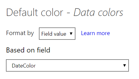
Then select Field Value in the Format By drop down list.

Following that, we select the column we just created, DateColor, from the Based On Field drop down list. Then click OK.
Now we should get a result as following.

From the above chart, we can see that the first business day of each month has been highlighted into a different color, which make it easier for users to read.
