Sometimes our data can have various data structures. For example, a company that has lots of sites may have more than one structure to group their sites. They may be group by regions and head offices while site is at the lowest level, regions and head offices are the highest level in their own structures. When we are creating the Power BI dashboards for that kind of data, we might need to have same charts with different legends to show the data patterns from different structures.
The easiest way is probably creating mutiple pages and put charts for each data structure on each page. But if you already have multiple pages for different visualizations, it will be likely to make users feel confusing. In that case, we can use Bookmark to enable showing the same charts with different data structures in one page. Bookmark enable us to configure and save specific, individualized views of report pages. Views of pages configured by slicers, filters, sort directions, and the new show or hide options in the selection pane can easily be saved as bookmarks.
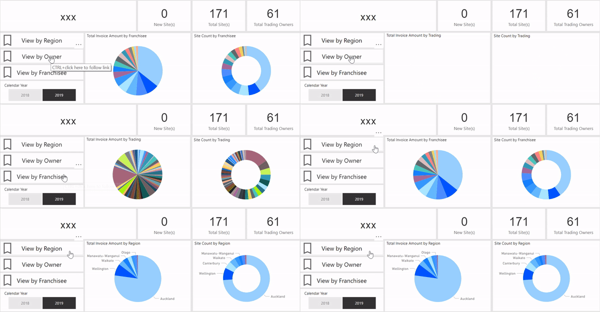
Here is an example of how it looks like:

From the above gif, we can see three buttons on the dashboard controlling different views. The default dashboard is showing the view by region. When I click on the “View by Franchisee” button, the view will be changed to the charts with franchisee as legends. And when I click on “View by Owner” button, the view will be changed to the charts with owners as legends.
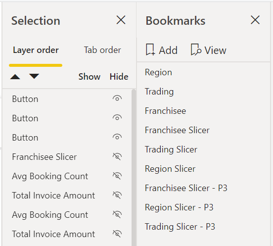
It’s actually quite simple to achieve. First, we tick the ‘bookmark pane’ and ‘selection pane’ under View. We will get something like the screeshot below.
First, we select what we want to keep on the current page and what we want to hide by clicking the ‘eye’ button in the selection pane, then we click ‘Add’ button in the bookmarks pane and rename it. Then repeat those steps until we create all bookmarks we need.
