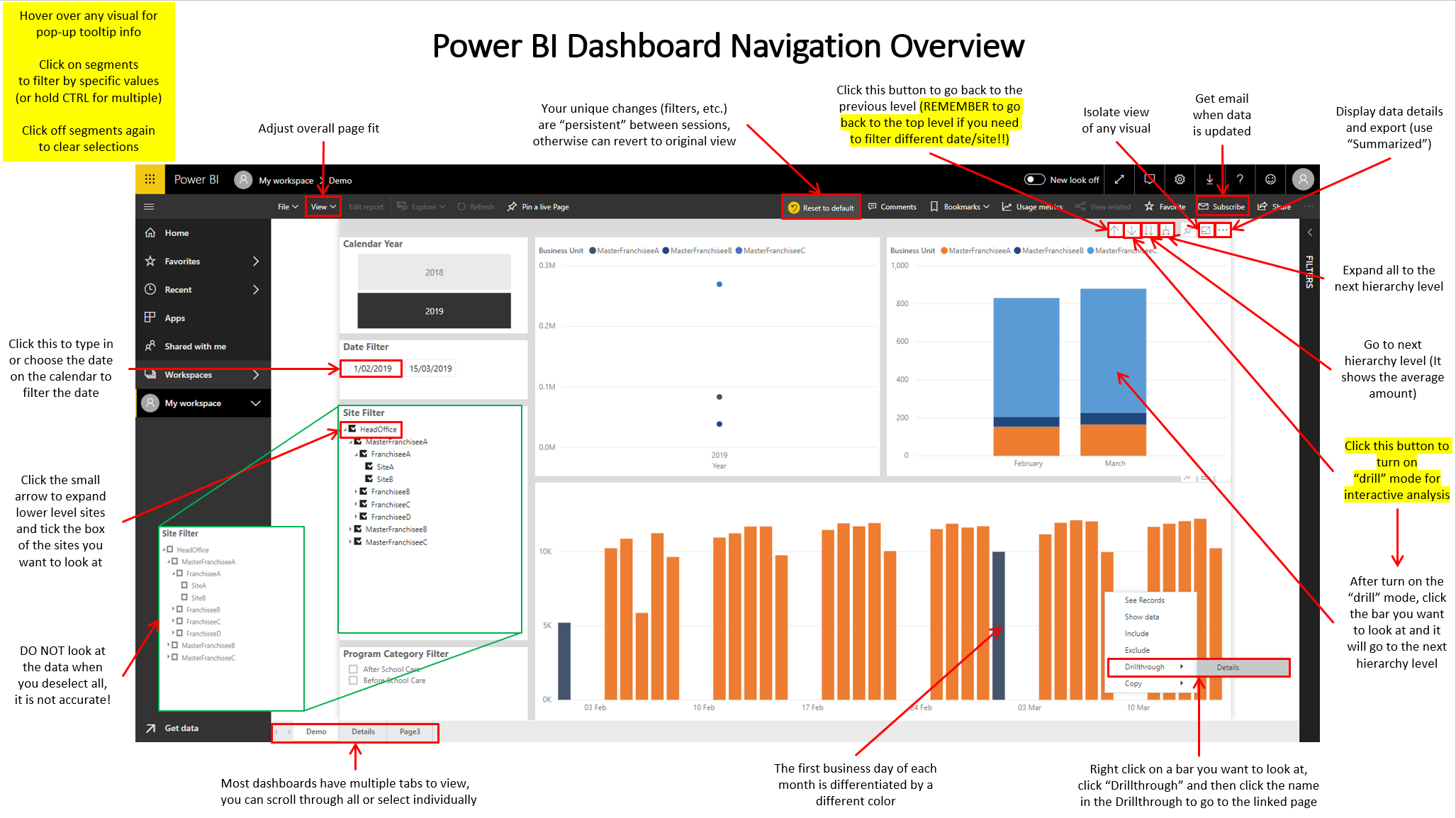
As a Power BI dashboard creator and designer, I can create complicated dashboards with powerful features. But sometimes our clients, people who view and use our dashboards, might be confusing while viewing the dashboards. Therefore, I have created a Power BI Dashboard Navigation Overview for the end-users which is showing below.
Schedule an monthly AUTO update for fact tables in data warehouse - SQL Agent Job
After we use stored procedure to create some fact tables in our data warehouse for visualization or analyzing purposes, we may need to update it periodly because our transactional database is kept updating. In that case, we might need to schedule an auto execution for the stored procedure to insert the latest records into the tables. SQL Agent Job is a service which enable us to achieve that.
Distinguish the color of the first business day of each month in the bar charts in Power BI
In Power BI, when we have a bar chart displaying quite a long period of time like the chart below, it might be quite hard for users to read which bar is the start date of a month. Therefore, we can consider highlight the bar of the first date of each month with a different color to make the chart clearer and easier to read. This article is explaining how we can achieve that.
Using Power BI Bookmark for data with multiple structures
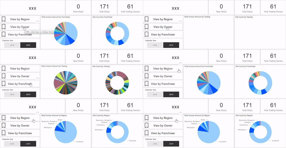
Sometimes our data can have various data structures. For example, a company that has lots of sites may have more than one structure to group their sites. They may be group by regions and head offices while site is at the lowest level, regions and head offices are the highest level in their own structures. When we are creating the Power BI dashboards for that kind of data, we might need to have same charts with different legends to show the data patterns from different structures.
The easiest way is probably creating mutiple pages and put charts for each data structure on each page. But if you already have multiple pages for different visualizations, it will be likely to make users feel confusing. In that case, we can use Bookmark to enable showing the same charts with different data structures in one page. Bookmark enable us to configure and save specific, individualized views of report pages. Views of pages configured by slicers, filters, sort directions, and the new show or hide options in the selection pane can easily be saved as bookmarks.
Here is an example of how it looks like:
How to add a user that is not in your organisation with Row Level Security (RLS) in Power BI ?
Row Level Security is a very powerful function in Power BI, it can help you restrict data access for given users. In Power BI desktop, filters restrict data access at the row level, and you can define filters within roles. The document of Power BI tutorial from Microsoft has explained how to use Row Level Security step by step. (https://docs.microsoft.com/en-us/power-bi/service-admin-rls)